The Psychology of Color and How It Transforms Your Living Space
Colors have an incredible ability to influence how we think, feel, and behave. In the context of home improvement, understanding the psychology of color can help you design spaces that not only look beautiful but also evoke the right emotions and energy. Whether you're renovating a single room or revamping your entire home, the colors you choose play a vital role in transforming your living space into a sanctuary of comfort, productivity, or relaxation.
In this article, we’ll explore the fascinating connection between colors and emotions, how different hues impact your mood, and practical ways to incorporate them into your home for maximum effect.
How Colors Influence Emotions and Behavior
The connection between color and psychology is deeply rooted in human evolution and culture. Colors have the power to evoke specific emotions and even influence behavior, often without us realizing it. For instance, warm colors like red and orange can energize a space, while cool tones like blue and green promote calmness and relaxation.
Studies have shown that color can affect everything from productivity levels to appetite. This is why fast-food chains often use red and yellow to stimulate hunger, while spas and wellness centers favor soft greens and blues to create a serene atmosphere. When applied to your home, these principles can help you craft spaces that align with your intentions for each room.
The Meaning Behind Popular Colors and Their Psychological Effects
Each color carries its own unique psychological impact. Here’s a breakdown of some popular colors and how they can transform your living space:
1. Blue: The Color of Calm and Focus
Blue is often associated with tranquility, trust, and focus. It’s an ideal choice for bedrooms, home offices, or any space where you want to feel calm and centered. Lighter shades of blue promote relaxation, while deeper hues like navy exude sophistication.
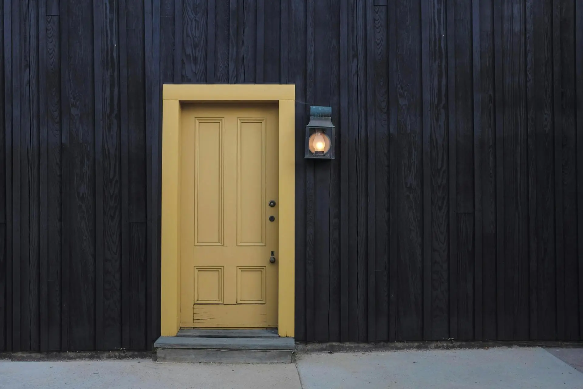
2. Yellow: The Color of Happiness and Energy
Yellow is the color of sunshine and optimism. It’s perfect for kitchens, dining rooms, or other areas where you want to create a cheerful and welcoming vibe. However, too much yellow can be overwhelming, so balance it with neutral tones.
3. Green: The Color of Balance and Renewal
Green is a versatile color that represents nature, growth, and harmony. It’s an excellent choice for living rooms or bathrooms, as it brings a sense of freshness and balance to the space. Soft sage greens are particularly popular for creating a soothing environment.
4. Red: The Color of Passion and Energy
Red is bold and stimulating, often linked to passion and energy. While it can be overwhelming if overused, red accents can add warmth and drama to living rooms or dining areas. Consider using it sparingly to avoid overstimulation.
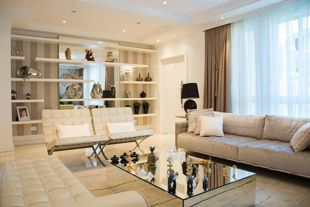
5. Neutral Tones: The Colors of Simplicity and Elegance
Neutral colors like beige, gray, and white are timeless and versatile. They provide a clean backdrop for other colors and allow you to experiment with bold accents. Neutrals also make small spaces appear larger and more open.
How to Choose Colors Based on Room Functionality
To optimize the psychological impact of color in your home, it’s essential to consider the function of each room. Here are some tips for choosing the right colors based on how you use the space:
- Living Room: Opt for warm, inviting tones like earthy greens, soft yellows, or warm neutrals to encourage relaxation and social interaction.
- Bedroom: Stick to calming hues like pastel blues, lavender, or muted greens to promote restful sleep.
- Kitchen and Dining Area: Energizing shades like yellow or orange can stimulate appetite and conversation, while white or light gray can create a clean, modern look.
- Home Office: Choose colors that enhance focus and productivity, such as blues or greens. Avoid overly stimulating colors like red.
- Bathroom: Soft, spa-like tones such as light green, aqua, or white can create a serene and refreshing atmosphere.
The Role of Lighting in Color Perception
Lighting plays a crucial role in how colors appear in your home. Natural light, artificial light, and even the time of day can significantly alter the way a color looks and feels. For example:
- Rooms with abundant natural light can handle darker or more saturated colors.
- Warm artificial lighting tends to enhance warm tones like reds and yellows, while cool lighting complements blues and greens.
- Test paint samples in different lighting conditions before committing to a color to ensure it works well in your space.
Incorporating Color Psychology Through Decor
You don’t have to repaint your walls to take advantage of color psychology. Small changes in decor can also make a big impact. Here are some ideas for incorporating color into your home:
- Throw Pillows and Blankets: Add pops of color to neutral furniture with bold, colorful textiles.
- Artwork: Choose paintings or prints that feature your desired color palette to tie the room together.
- Rugs: A vibrant area rug can anchor a room and introduce a new color scheme.
- Plants: Greenery not only adds color but also brings life and freshness to any space.
Common Mistakes to Avoid When Using Color
While color can transform your space, it’s easy to make mistakes that lead to an unbalanced or chaotic look. Here are some pitfalls to avoid:
- Overusing Bold Colors: Too much of a bold color can overwhelm a room. Balance it with neutrals or softer tones.
- Ignoring Room Size: Dark colors can make small spaces feel even smaller, while light colors can open up a room.
- Forgetting About Lighting: As mentioned earlier, lighting affects color perception, so always test colors in the actual room before making a decision.
Color Trends in Modern Home Design
While timeless colors like white and gray remain popular, modern home design is embracing bolder, more adventurous palettes. Some current trends include:
- Earthy tones like terracotta, olive green, and rust for a grounded, natural feel.
- Jewel tones such as emerald green, sapphire blue, and amethyst purple for a luxurious touch.
- Soft pastels like blush pink and dusty blue for a subtle yet stylish look.
These trends reflect a growing desire for personal expression and connection to nature in home design.
The Long-Term Impact of Color on Mental Health
Beyond aesthetics, color can have a lasting impact on your mental health and well-being. A well-designed space with thoughtfully chosen colors can reduce stress, improve focus, and even boost your mood. Conversely, poorly chosen colors can create feelings of discomfort or unease.
By understanding the psychology of color, you can create a home that not only looks stunning but also supports your emotional and mental health.
Transform Your Space Through the Power of Color
The psychology of color is a powerful tool for transforming your living space into a place that truly feels like home. By thoughtfully selecting colors that align with the purpose of each room and your personal preferences, you can create an environment that enhances your mood, productivity, and overall well-being. Whether you’re drawn to calming blues, energizing yellows, or timeless neutrals, the right color choices can make all the difference.
Embrace the transformative power of color and let it guide you in creating a home that reflects your personality, supports your lifestyle, and brings you joy every day.